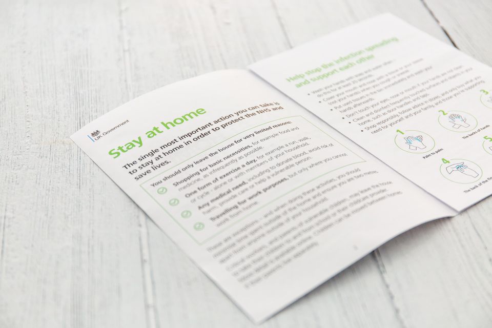
Brochures are an effective marketing tool to promote your business, products, or services. They often attract customers, provide information about your company, and showcase your products. However, a well-designed brochure can positively impact your business and turn potential customers away. This article will discuss eight brochure design mistakes that might affect your business.
Mistake #1: Poor Layout and DesignOne of the biggest mistakes in brochure design is a poor layout and design. Brochures that are cluttered, disorganized, or lack visual appeal can be unattractive to potential customers. A good brochure design should be visually engaging, readable, and have a clear information hierarchy. Use clear and concise headlines, use white space effectively, and avoid overcrowding the pages.
Mistake #2: Inconsistent BrandingYour brochure should be consistent with your brand identity. Using inconsistent branding can confuse customers and make your business appear unprofessional. Your brochure should use the same color scheme, fonts, and logos as your other marketing materials. This consistency helps to reinforce your brand identity and make your business more recognizable.
Mistake #3: Poor Quality ImagesImages are an essential component of brochure design. Low-quality images or poorly chosen images can make your brochure look unprofessional. Use high-resolution images that are relevant to your business or products. Images should be clear, in focus, and properly exposed. Avoid using stock images that are overused or generic.
Mistake #4: Too Much TextYour brochure should be easy to read and understand. Too much text can make your brochure appear overwhelming and difficult to read. Use short paragraphs, bullet points, and subheadings to summarize the text. This makes it easier for customers to skim the brochure and find the necessary information.
Mistake #5: Lack of White SpaceWhite space is the area between design elements in your brochure. It is essential to include enough white space to make your brochure visually appealing and easy to read. Too much text or images can make a brochure feel cramped and overwhelming. Use white space to separate different brochure sections and make it easier for customers to read.
Mistake #6: Poor Printing QualityThe quality of your brochure printing can also affect the impression it makes on your customers. Poor-quality printing can make your brochure look cheap and unprofessional. Use high-quality paper and printing techniques to ensure your brochure looks professional and polished.
Mistake #7: Lack of Call to ActionYour brochure should have a clear call to action (CTA). A CTA is a statement that encourages customers to take a specific action, such as visiting your website, calling your business, or making a purchase. Customers may not know what action to take after reading your brochure without a clear CTA. Make your CTA stand out and clarify what action you want customers to take.
Mistake #8: Ignoring Your Target AudienceYour brochure should be designed with your target audience in mind. Ignoring your target audience can make your brochure less effective. Consider the age, gender, interests, and needs of your target audience when designing your brochure. Use language and images to appeal to your target audience, and ensure that your brochure's information is relevant.
ConclusionYour brochure is a reflection of your business and can have a significant impact on your marketing efforts. Avoiding these common brochure design mistakes can help you create a brochure that is visually appealing, easy to read, and effective at promoting your business. It is always important to keep your target audience in mind and ensure that your brochure addresses their needs and interests. By avoiding these mistakes and creating a well-designed brochure, you can leave a lasting impression on potential customers and increase your chances of success.
At Printree, we pride ourselves on providing exceptional customer service and high-quality prints. We offer various
brochure printing options, including different paper stocks, sizes, and finishes, to help you create the perfect brochure for your business. Contact us today to get started on your brochure design and printing project.

